S o f t
C o l o n i a l
W a n d e r
l u s t
DESCRIPTION
Evokes Victorian-era imperial/technological/consumerist optimism, wonder and whimsy.
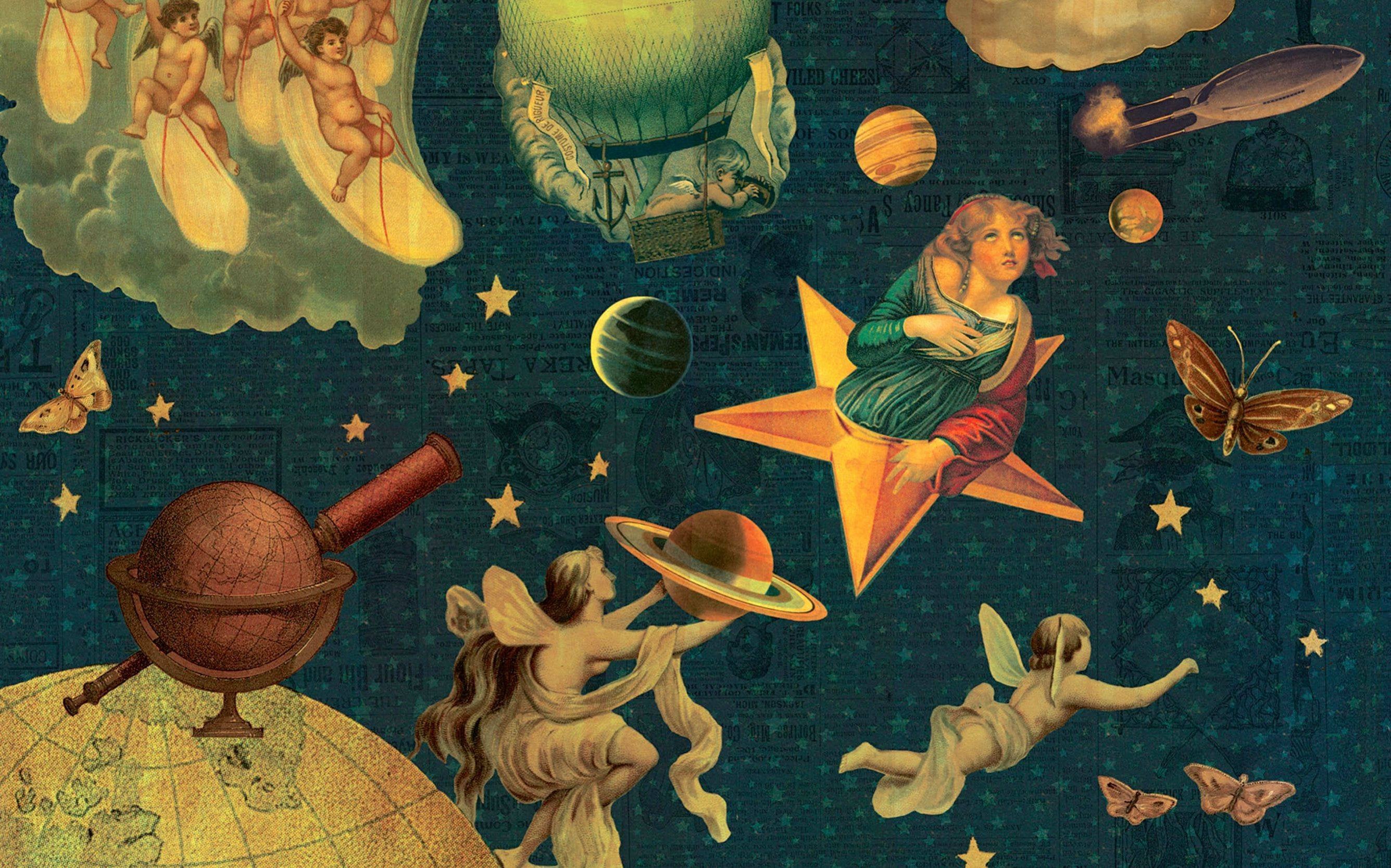
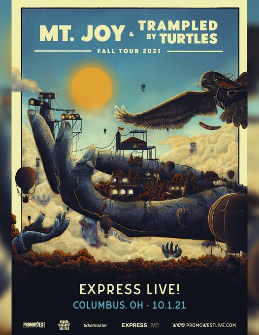
Maps, wanderlust and leisure travel via boat or small aeroplane, hot air balloons, magical ways of looking at travel, luggage labels, posted letters, the eiffel tower, travelling circuses (& sideshow performers), strings of lightbulbs
Phonographs, typewriters, lightbulbs, penny farthings, grammarphones, radio waves and general machinery of the decade that's on the verge of modernity being used today, 'impossible' rube-goldberg-like machinery and machinery interiors. NOT steampunk or factories.
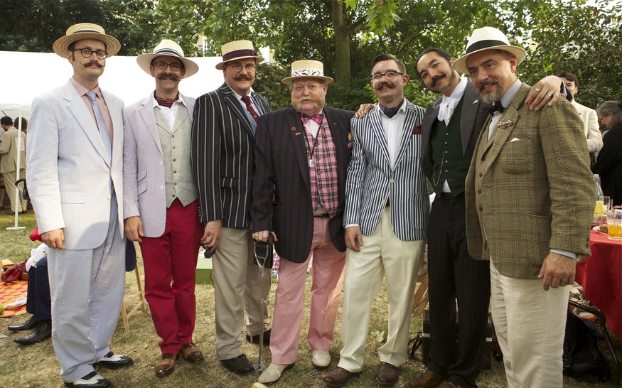
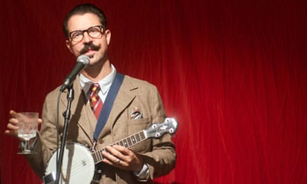
Whimsical masculinity: monacles, moustaches, top hats, pipes.
Victorian-to-1940s at the latest
Engraved prints like from a Victorian newspaper or book - decoupage, collage - interesting types of paper: Technical diagrams, sheet music, dictionary pages, maps, product packaging, posters/adverts wheatpasted on walls, naturalist sketches, phrenology heads
ostentatious typographical confetti - 'fig.01', ampersands, curly brackets, manicules, typography as design, letterpress block printing, jumbled cut-out font, circus fonts
animation, like early film or 2D cut-out animation / sepia or film flicker colours
politically, we are 'post-problematic' so can joke at views in the past to distance ourselves; post 9/11 imperial anxiety
Terry Gilliam, Jules Verne, Georges Melies, Dadaism.
Adjacent to: indie music, hipsters, steampunk, decay victoriana.
Shares victorian typography and indie down-to-earth aspirations with Genericana. Shares handcrafted-visuals with Indiecraft.
History of the term
Soft colonial wanderlust consumer aesthetic has an associated facebook community
This page was researched by the Consumer Aesthetics Research Institute, with examples found by many volunteers.
Soft Colonial Wanderlust is a thinly-veiled layer of irony over actual colonialist longing; the continued exploitation of unseen workers abroad which began in the historic colonial period; consumerism and cutesy patriarchal nostalgia. Turn it into a TikTok trend at your peril.
The key Soft Colonial Wanderlust period is 2001 - 2010, with an aftertail continuing to around 2016.
Visual Motifs
Maps, wanderlust and leisure travel via boat or small aeroplane, hot air balloons, magical ways of looking at travel, luggage labels, posted letters, the eiffel tower, travelling circuses (& sideshow performers), strings of lightbulbs
Phonographs, typewriters, lightbulbs, penny farthings, grammarphones, radio waves and general machinery of the decade that's on the verge of modernity being used today, but NOT exactly steampunk; including 'impossible' rube-goldberg-like machinery and machinery interiors. But never/very rarely 'factories' - the technologies on display are more Jules Verne whimsy. Here, the romance of travel and colonial ingenuity is travel to the future.
Whimsical masculinity: monacles, moustaches, top hats, pipes.
Use of Media
- Engraved prints like from a Victorian newspaper.
- A sense of decoupage - like two elements have been cut out of a newspaper and juxtaposed in a new way.
- Cut from interesting types of Victorian book/found paper: Technical diagrams, sheet music, dictionary pages, maps, product packaging, posters/adverts wheatpasted on walls, naturalist sketches, phrenology heads)
- Ostentatious typographical confetti - '{fig.01}', pointing fingers, ampersands, curly brackets, manicules.
- Cut-out figures which are 2D animated (similar to Terry Gilliam style).
- Compositions with lots of figures and objects juxtaposed
- Performers entering into material spaces (film or animated books) which feel curiously 'empty', like they have a single item of florid furniture in
- Typography as a design feature
- Typewriters, typewriter text
- Text cut out from a book or newspaper
- Letterpress block printing
- 'jumbled font', often cut from newspaper
- Frilly, carnival/circus fonts
- Ampersands
- animation
- Flickering black&white film like a silent movie
- Jerky footage
- 2D animation with cut-out figures
- Stop-motion
- Colors
- Sepia, sepia colour tones
- Creepy b&w contrast, like the tones of old newsprint or flickering film
- Earlier SCW uses colourful cut-outs; peak period uses
- Where it overlaps with vaudeville/decay victoriana, highly saturated
Influences
The motifs are typically Victorian, but the art styles it draws from tend to be 1920s. However, some examples draw as late as the 1950s - often because actually identifying with someone in Victorian dress is harder than a person who seems 'modern'.
- Terry Gilliam animation
- Rube Goldberg machines
- Georges Méliès films
- Dadaism
- (for example: Self-portrait, artwork by Austrian artist Raoul Hausmann, 1920s).
- Jules Verne
Politics
The Soft Colonial Wanderlust period is roughly 2001 (and the release of Moulin Rouge!) through to 2010, with a tail for a few years afterwards.
world events
The (most recent) 'western' war on Iraq began in 2002, with American and British troops present through to 2011 - paralleling this aesthetic period closely. Troops entered Afghanistan in 2001. The 9/11 attacks sparked a period of colonial anxiety, to be resolved by new colonial wars, and an aesthetic trend in media and branding depicting such adventures as whimsical, victimless, 'clean', jolly good fun.
Anglo-Afghan Wars, three conflicts (1839–42; 1878–80; 1919) in which Great Britain, from its base in India, sought to extend its control over neighbouring Afghanistan and to oppose Russian influence there.
Encyclopedia Britannica
In the essay 'Millennial Englishness' (in New Model Island (2019)), Alex Niven notes that 'England' as a concept came back into the public discourse in the 00s & 10s (in contrast with the 80s & 90s, and 'cool britannia', 'britpop', the BNP where 'Britain' was the central construct) - supported by Joe Kennedy's book Authentocrats.
Readers who have been paying even slight attention to the 2010s culturescape — from pop albums like P.J. Harvey’s Let England Shake and the Good the Bad & the Queen’s Merrie Land, to countless art exhibitions and installations exploring “England beyond Brexit”, to recent trade and middlebrow books like Robert Winder’s The Last Wolf: The Hidden Springs of Englishness, Alexandra Harris’s Weatherland: Writers & Artists Under English Skies, Nick Groom’s The Seasons: A Celebration of the English Year, Ben Fogle’s English: A Story of Marmite, Queuing and Weather and Harry Mount’s How England Made the English: From Why We Drive on the Left to Why We Don’t Talk to Our Neighbours — will already be wearily familiar with the ubiquity of the Englishness franchise in contemporary discourse.
According to Joe’s account in Authentocrats, the recent bourgeois vogue for twee artefacts and rural lifestyle touchstones has shaded into a much more politically questionable liberal revival of English patriotism.
It is likely that SCW would have faded from consciousness within that first decade - and yet examples persist throughout the 2010s, which to my mind may reflect Brexit (in the UK context) and ongoing anxieties of western imperial powers about their place in the world. In the UK, this period coincided with 'austerity' (2010- 2019) - a gradual cutting of public services by the Conservative government. People felt increasingly poor and like society was coming to pieces; yet SCW stylings make the consumer feel 'posh' or 'proud', selling a fantasy because poverty and depression is bad for the economy. PM David Cameron deliberately used 1940s retro stylings to portray baking your own bread to save money as a jolly, nostalgic, 'help your country in times of war' instead of unhappy 'Girl Named Jack'-style crisis survival. Two examples are Jamie Oliver's Ministry of Food (2008 onwards) to the Great British Bake Off (2010 onwards)
I'd like to argue that despite the name 'victorian', this trend draws from a broader range of dates. Victorian people are used when it benefits the brand to use 'distancing' - for example, a adventurer searching for crisp spices whimsically instead of contemporary appropriation, exoticisation and labour exploitation abroad, or a mad inventor developing new flavours with magical machines. Whenever the customer is represented, however, they will be in a more 'relateable' decade - 1940s burlesque glamour for celebrities, 1930s tea dresses in fashion for women, and 1950s children's holidays to the seaside by train.
The 'tweeness' and collage elements of SCW are rarely seen now, except in very specific brands, where once they were everywhere. However, the troubling popularity of nostalgia-for-the-olden-days content promoted by fascist-adjacent internet personalities may be its modern manifestation and legacy.
And we are still fighting and sponsoring war in the SWANA regions.
Interpretations
The softness of soft colonial wanderlust can be understood as similar to the tender of tenderqueer; i.e. a cutesiness that masks deep violence
SCW artworks give the air being 'post-racism' and 'post-class' and we can therefore enjoy this sort of thing 'ironically'. Examples include: twee upper class characters and depictions of upper class people; images of sideshow performers from freak shows; misogyny and racism but with a 'knowing' wink.
Penhaligon’s pries open the apothecary tables of ancient Egypt, but to no avail. The empty-handed journey back from Cairo allows us time to smell the roses – how very pleasing they were! We decide to use the city of Cairo as a muse – Damascan Rose is macerated in an overdose of woods and spices – the scent mirrors the city. Cairo instantly enthrals, yet reveals deeper treasures over time.
Heritage - Penhaglion’s website (2024)
A 'cutesy' sense of wonder about Victorian consumerism and enthusiasm for marvellous inventions as a way to get ironic distance from contemporary consumption. Brands evoking historic colonialism with a wink-of-the-eye to obscure contemporary colonial practices and relationships in their manufacture and distribution chains. In practice, contemporary labour exploitation in the global south continues inqualities begun in Victorian/pre-Victorian colonialism. Products using SCW motifs often choose them to brand product lines with 'flavours from all over the world' (Penhaglions, Phileas Foggs), blotting out the cruel history of exploration for resources, and reducing other peoples to 'exotic' reference points.
Similarly, the cutesy wonder towards genius and invention and the marvel of technology masks the realties of how objects are produced - the locations, the experiences of workers, and destruction. The rise of SCW followed the decade in which the internet changed everything, with its diffuse and intangible interfaces, its mysterious all-pervading aether, its deliberately impenetrable chains of control and material manifestations (server farms, undersea cables, underpaid video content reviewers, etc). SCW evokes the enthusiasm for unbridled progress and advancement visible in both the 00s and the Victorian period; but also reveals an anxiety about this slippery new domain, proposing the romance of Verne machinery and Rube Goldberg designs where the whole design can be easily seen and comprehended.
The 'nations' visible as protagonists in SCW are England and France. England continues to have 'poshness' as an international brand identity. Meanwhile, French accents (notably Verne references and Eiffel tower motifs) tend to represent whimsy, presumably because the key consumers of these products are English-speaking and therefore view France as a jolly, but non-exotic, place for a holiday.
Like all 'ironic' depictions of bad stuff, much of this is a way to safely expereiment with unpolite ideas you genuinely believe. For example, the Chap magazine's protests were:
against what they see as modern living's vulgarity in general; "against the pointless intrusion by contemporary art pieces into public areas";"to draw attention to the appalling lack of gentlemanly services available on Britain's high streets"; against modern art installations;against the proposed opening of an Abercrombie and Fitch store at the centre of traditional English gentleman's tailoring, Savile Row.
all of which are fascist-adjacent and classist goals. Some analysis by participants in SCW-adjacent subcultures during the period:
The key attraction, it seems, is the tremendous optimism of the Victorians and Edwardians. "The impression we get of the Victorian era, however inaccurate," says Tom Wright, author of a blog called London Particulars, "is that they thought the future was going to be awesome."
Steampunk rockers: the trend for tweed - Jenny Hall - 2010
By implication, then, participants were attracted because they knew the present day was NOT in fact awesome. Mark Fisher argued that in this decade, hauntological media such as the crackle of a Caretaker album, the public-service-industrial of Mordant Music's Dead Air or the melancholic post-rave comedown of Burial revealed the 'slow death of the future', the end of our ability to even imagine a time beyond neoliberalism, or that the future would be exciting - or even different. We might understand some of the appeal of Victoriana, then, as retreating to a time in which the future can seem exciting again. In particular, this period saw a profound expansion of the internet's role in society, and increased techno-pessimism about the opaque and oppressive powers of Silicon Valley; but the Victorian is a technological optimist, especially the Jules Verne protagonist. More importantly, perhaps, the steampunk protagonist is in control of the technology - professors, inventors, and geniuses, creating not the iPhone but magnificent flying machines.
I believe SCW products were aimed at a middle class consumer. The role of the middle class has always been to bolster the ruling class in the hope of ascending to it: these are products for people who want to feel 'a bit posh' by, say, buying a shaving cream with a picture of a moustachio'd aristocrat on it, but do not feel any disquiet about what that aristocrat represents. Actual upper class people buy from genuinely posh retailers - or, famously, in the UK - are astonishingly cheap in their purchase preferences. I recently spoke with someone who attended a Chap picnic, whose memories backed this suspicion. They said the demographic was an even split between goths and the sorts of people who moved to London to wear Ralph Lauren and 'be something' in the City.
Memory
I was at university 2009 - 2011, as this trend was at its apex. My feelings about the trend were always awkward. I was hugely into Victoriana at the time, and a lot of these products hit me as 'so close but too far away' - feeling like a commercialisation of something I enjoyed that didn't speak to what I loved. I wanted time travel. I didn't quite have the design insight to point to the 'errors' in the fashions, but victoriana didn't feel quirky to me - it felt dark, and like home, and was very much about real antiques (if only I could get them). I had an arsenic-green bow tie but could never figure out how to wear it. Deep in my jack the ripper phase, which spoke to me of a kind of ghostliness in the city, a passageway into the past, and an image of masculinity which was dangerous, shapeless and compelling, and contrasted with the also-appealing repression and confinement of the respectable man of the period drama, an image of benign darkness. That was me: a kind of hipster about the victoriana hipsters.
Nevertheless, I was certainly part of that moment: I carried a gentleman's cane around town, went to gigs in a top hat, and used the penny farthing as a personal symbol. I had the ceramic phrenology head and got everything I could in big luxurious damask. I'm more embarassed by that interest politically now than I was when I was 19 (I've given away the drinks bar shaped like a globe I craved so dearly as a teenager, it's colonial cringe), and with the gentleman as a point of identification; but I still go nuts for a Morris wallpaper or a day out at a stately home. It's hard to see through something that felt so personally, intimately mine and of my psychology to judge to what extent I was picking up on the cultural moment, or if I would always have been like this.
Key Examples
Music Videos
- CW: flicker - Playlist of all videos
- Smashing Pumpkins - Tonight Tonight - directed by Jonathan Dayton and Valerie Faris (1996) - alt rock.
- Considered to be one of the greatest music videos ever made
- Re-released in a special edition in 2012
- I was amazed to discover this was from the 90s because this was everywhere on music television during the SCW period when I was a teen
- Probably an Ur-example for Indiecraft, as well as Soft Colonial Wanderlust
- Take Me Out - Franz Ferdinand (2004) - dir Jonas Odell. Indie.
- "Alex Kapranos described the video's influences as Dada, the films of Busby Berkeley, and Soviet propaganda, and praised Odell's direction."
- Much of this is a common visual tic for Ferdinand, sans the victoriana:
- Dark of the Matinee uses flickering cinema, actors treated like animated figures, vintage film clips, B&W, technical diagrams, machines and symbols for sound technology
- This Fire also uses collage, typography, planes and maps, the band inside of diagrams and words, diagrams, but it feels far more 30s/Soviet
- Float On - Modest Mouse (2004). Indie.
- Notice: machinery; flat 2d animation; cutouts from victorian books; collaged elements; victorian shirts without collars; moustaches; that wallpaper; flickering light tone; human actors treated like cutouts; sheet music; melies moon
- Regina Spektor - Us (2006). Indie.
- Person treated like an animated cutout; maps; those empty, charcoal stage-like rooms; animated cut-out victorians; a globe; vintage clothing (vaguely 40s); cut-out letters; cogs, collage; sound technology (morse code);
- Elephant Gun - Beirut (2007). Indie.
- Notice: compass at start; the wallpaper, collaged book pages; girl in vintage underwear worn as underwear - suspender belts with thigh-high tights, rompers, tiered-petticoats; nonspecific vintagey menswear plus moustache; strings of lights; hollow rooms with one victorian object, in this case a sofa; twee instruments - trumpet, accordion, triangular ukelele thing; protagonist dreams of going to the seaside;elephant guns
- Wax Tailor Ft. Charlotte Savary - Seize the Day (2008) - Trip hop (artist also does electroswing)
- Caravan Palace - Suzy (2012) - electroswing band
- Ready to Go - Panic! At the Disco (2012)
- Brief segment: Actors as animations; melies moon; Sideshow cannon; goggles; charcoal tones
Films
- The Adventures of Baron Munchausen (1988) - dir. Terry Gilliam
- This film is listed on the official site as within this style; I disagree. It's too early.
- However, it can certainly be understood as a precursor: Gilliam is one of the best-known users of cut-up-Victorian-animation in popular culture
- It also includes romantic travel, hot air balloons, and colonial nostalgia
- Moulin Rouge! (2001) - dir. Baz Luhrmann
- Extremely influential on aesthetics of this decade
- Not just the orientalist Victoriana of it, but it also has a "collaged" aesthetic (musically, visually, narratively)
- Elephant Love Medley sequence: juxtaposed/collaged elements, including a "victorian illustration" style smiling moon, nostalgic-romantic elements from the Paris skyline, the sky with stylised stars - and moments before the protagonists were flying through the environment, which is similar to the Tonight Tonight
- A key film location is a giant model elephant with a courtesan's boudoir inside - which again combines the victorian exotic imagination (elephants; courtesans) with a sort of collage mood (an elephant out-of-place)
- Sherlock Holmes (2009) - dir. Guy Richie
- End credits
- considered Steampunk at the time; use of 'old film flicker' colours and footage; human actors turned into images; use of victorian books & paper material
- Hugo (2011) - dir. Martin Scorcese
- trailer
- To spot: the eiffel tower, the train station, Paris at night, fairground, past-ish-without-being-super-clear-when cosiness, theatre as a setting, Georges Melies visual quotes, not-quite-steampunk but you'd probably call it steampunk if you didn't know what else to call it
- Based on a book by Brian Selznick from 2007
Book covers
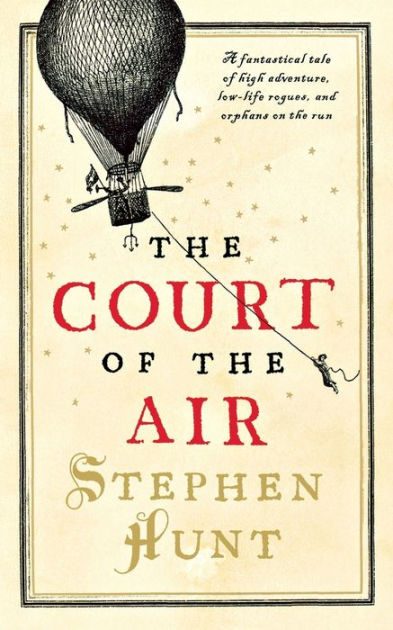
- Court of the Air by Stephen Hunt (2007); a steampunk novel
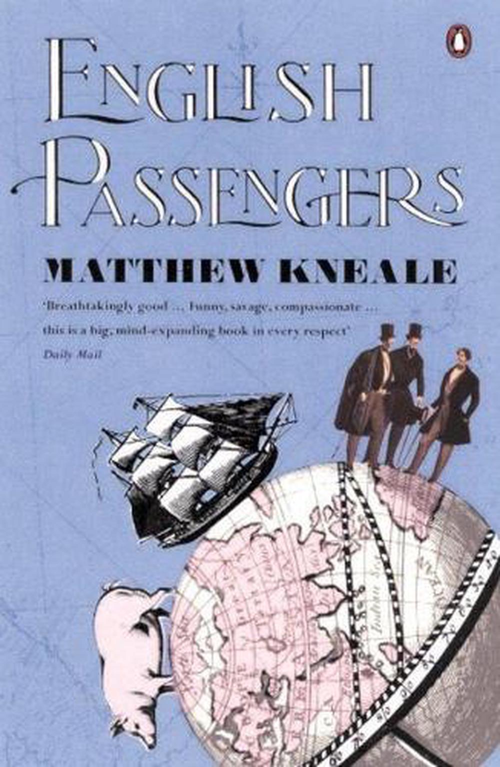
- English Passengers (first edition 2000) by Matthew Kneale
- SCW edition (post-2000): Title Typography by Neil Gower; Cover Illustrations: Mary Evans Picture Library
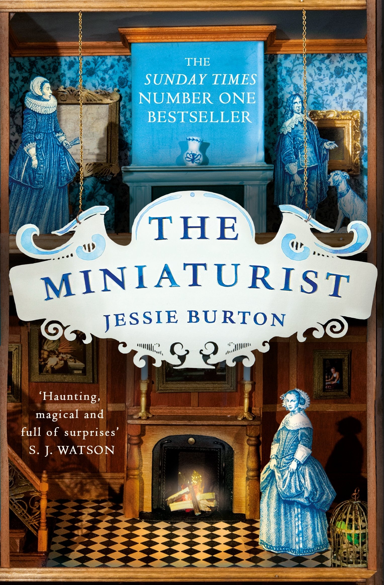
- The Minaturist - Jessie Burton (2014)
Album Covers
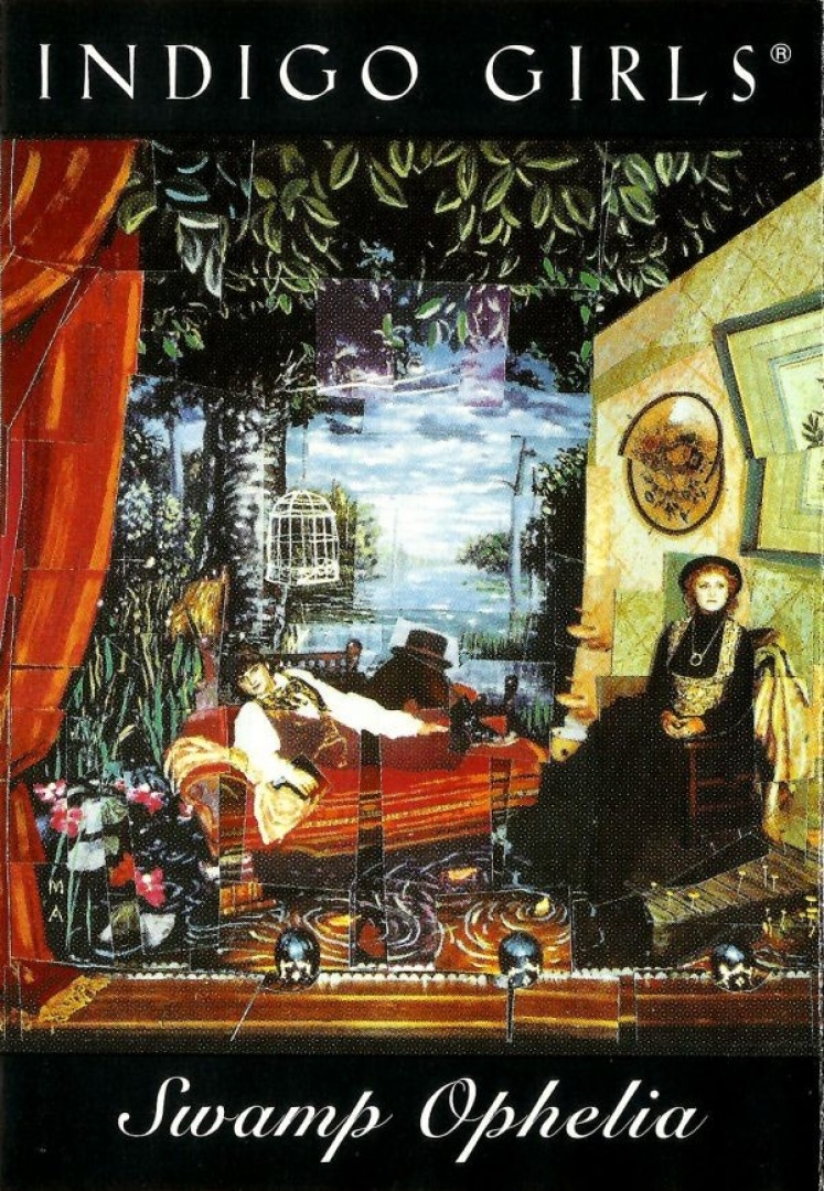
- Indigo Girls - Swamp Ophelia (1994)
- Art Direction, Design – Risa Zaitschek; Artwork [Cover] – Michael Allen
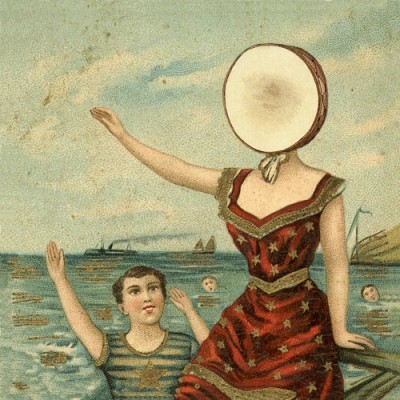
- Neutral Milk Hotel – In the Aeroplane Over the Sea (1998)
- designed by Brian Dewan
- lofi indie
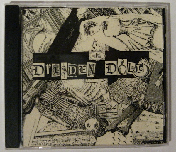
- Dresden Dolls demo
- sold at shows 2001-2004
- indie cabaret
- Likely designed by a band member
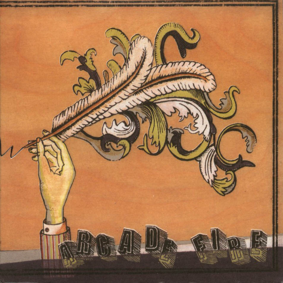
- Arcade Fire - The Funeral (2004) -
- designed by Tracy Maurice
- indie rock/baroque pop
- The design was inspired by Maurice's own collection of antique photographs and early 20th-century illustrated books, as well as the aesthetics of Japanese woodblock prints and Donovan's album Barabajagal.
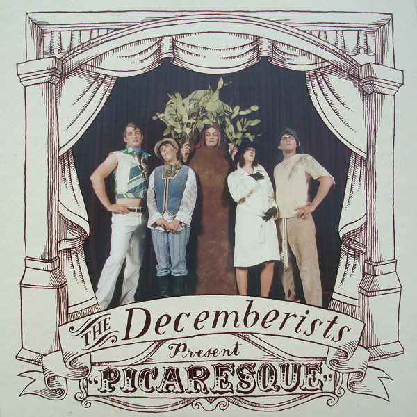
- Decemberists - Picaresque (2005)
- Design & Illustration - Carson Ellis; Photography - Alicia J. Rose
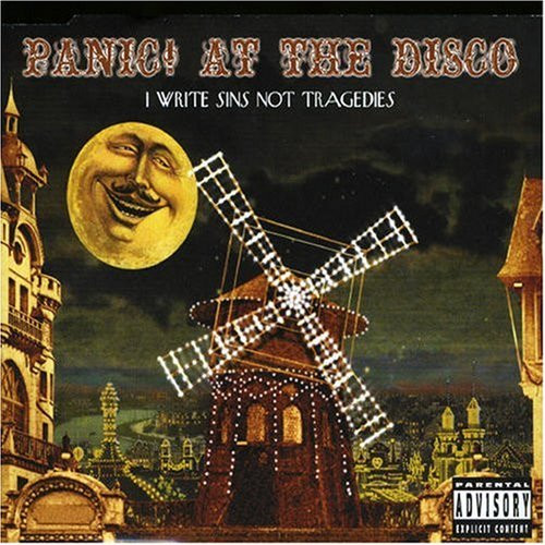
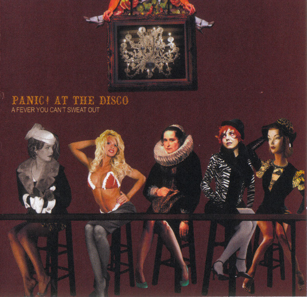
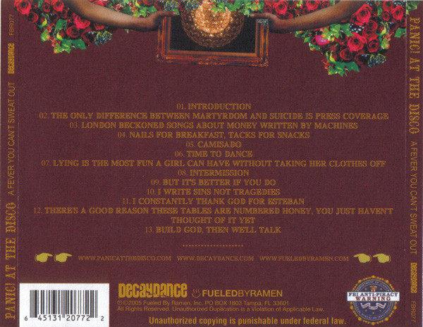
- Panic! At the Disco - A Fever You Can't Sweat Out (2005)
- Panic! At The Disco - I Write Sins Not Tragedies alternate single cover (2006)
- Illustrated by John Craig
- emo
- Inspired by Moulin Rouge; the video is an example of paralell aesthetic Decay Victoriana
- Panic! used these aesthetics extremely frequently
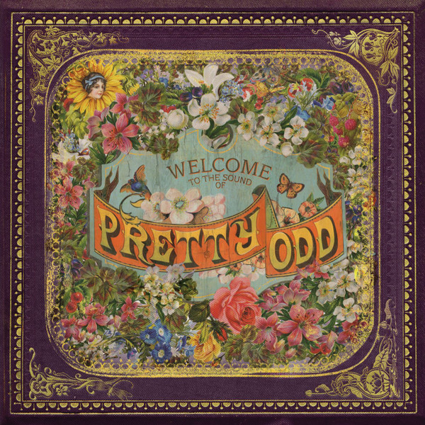
- Panic! at the Disco - Pretty. Odd. (2008)
- art direction: Alex Kirzhner, panic! at the disco illustration: Alex Kirzhner, Connie Makita, Tanapan Puangpakdee photography: Jennifer Tzar
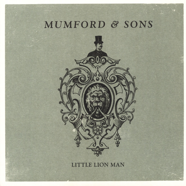
- Mumford and Sons - Roll Away Your Stone (single) and Little Lion Man (single) - (2009)
- Designed by Studio Juice
- indie /folk/bluegrass
- See also the video, which is on the borderlands of this style and decay victoriana, with the use of a theatre, chiascuro string bulb lighting, twee instruments, and old-worldy menswear
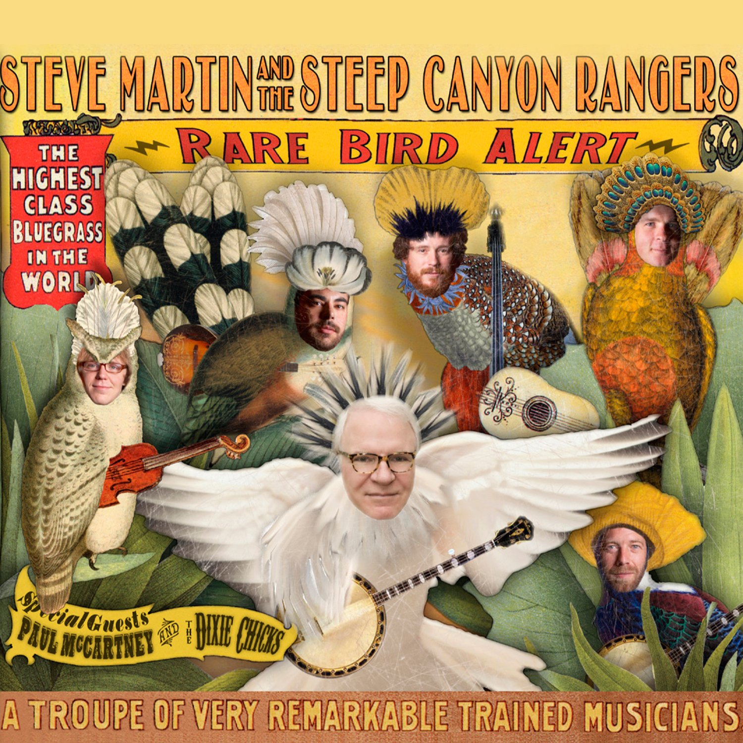
- Rare Bird Alert - Steve Martin and the Steep Canyon Rangers (2011)
- artwork: mark bliesener, g.carr; design: g. carr, salli ratts, jim ratts
- bluegrass
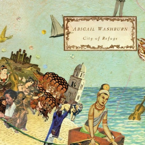
- City of Refuge - Abigail Washburn (2011)
- cover art by Erica Harris
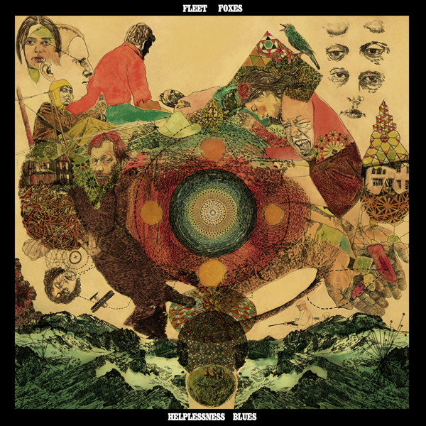
- Helplessness Blues - Fleet Foxes (2011).
- Cover art illustrated by Toby Liebowitz and painted by artist Christopher Anderson.
- Photocollage by N Pecknold (? image is too low quality for me to be sure)
- Indie/baroque pop
- I often think the song Helplessness Blues is the most millennial song ever written
- The Smashing Pumpkins — Mellon Collie and the Infinite Sadness - 2012 remaster edition.
- "The artwork and visual design were conceived by Wisconsin-based illustrator and collage artist John Craig, who had spent most of his career taking editorial commissions for magazines. Craig worked from Corgan's scribbled notes and crude sketches, most of which arrived via fax. Craig made other illustrations that appear throughout the album's packaging—animals smoking pipes, celestial bodies with faces, wayward children walking eerie dreamscapes—all with a vaguely antique quality"
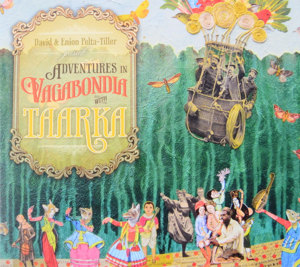
- Taarka - Adventures in Vagabondia (2013)
- album art by Erica Harris
- 'gypsy jazz', bluegrass, folk
Products
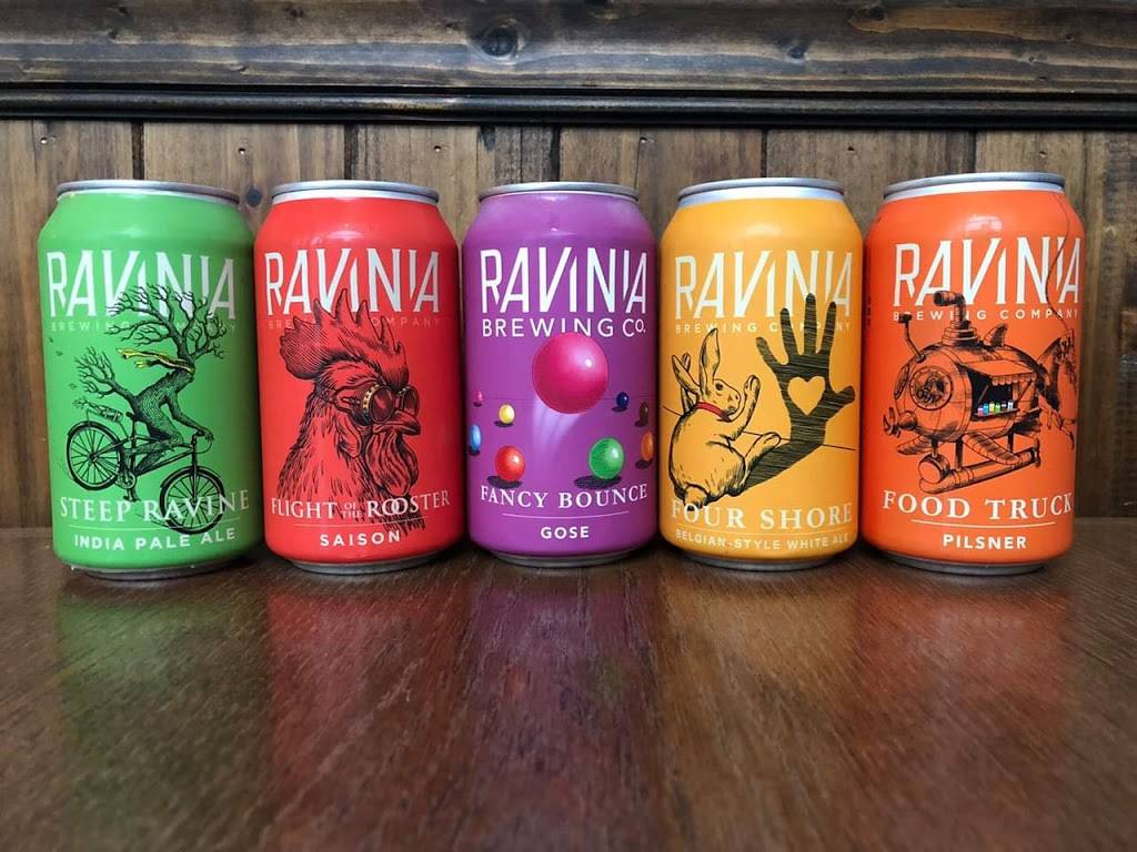
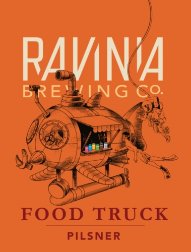
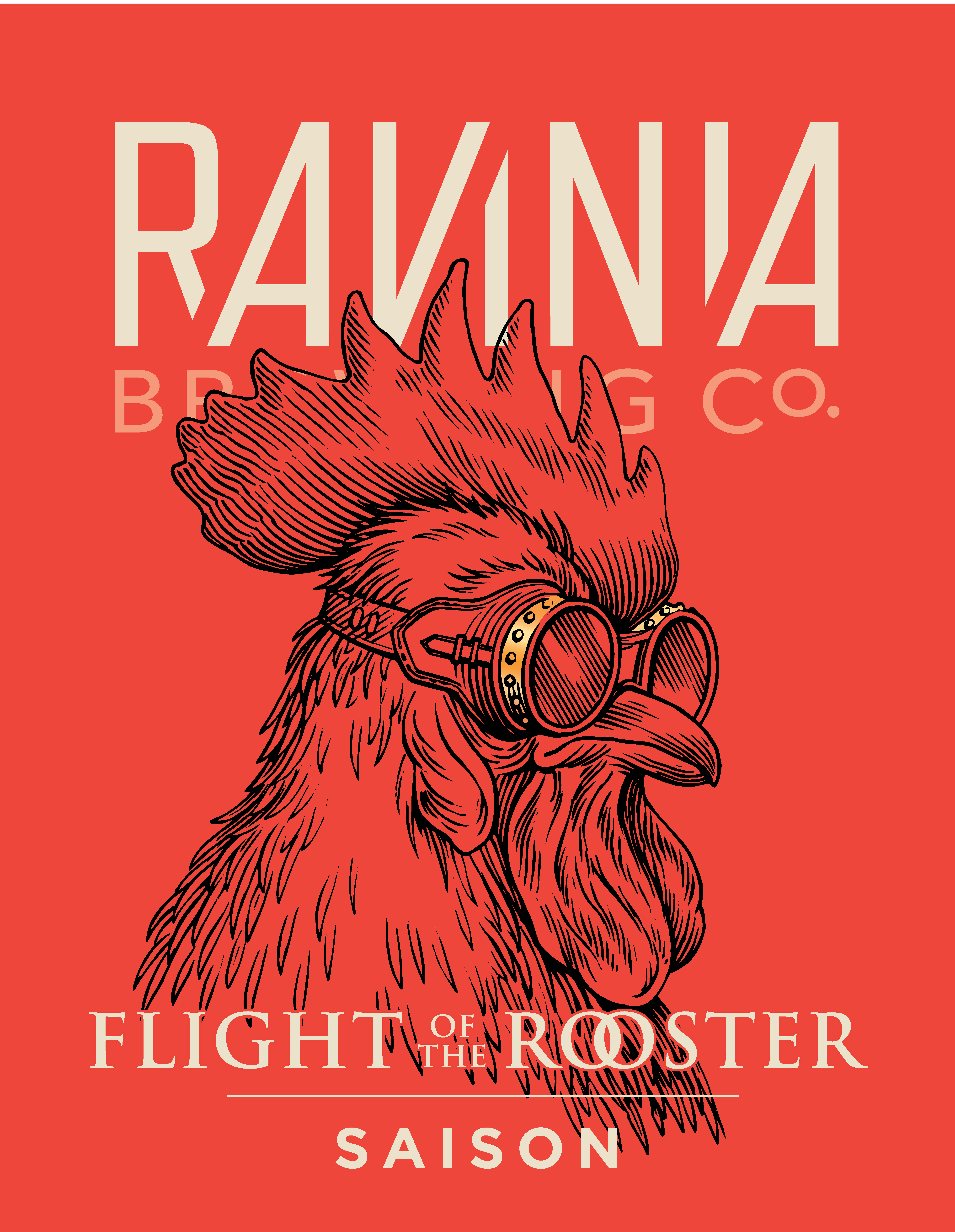
- Ravinia Brewing Company branding (2017) - designed by The Brandit
- Motifs include collaged engravings, a bike, a fantastical machine and steampunk goggles
- Kingsway Meats Packaging by Steven Noble
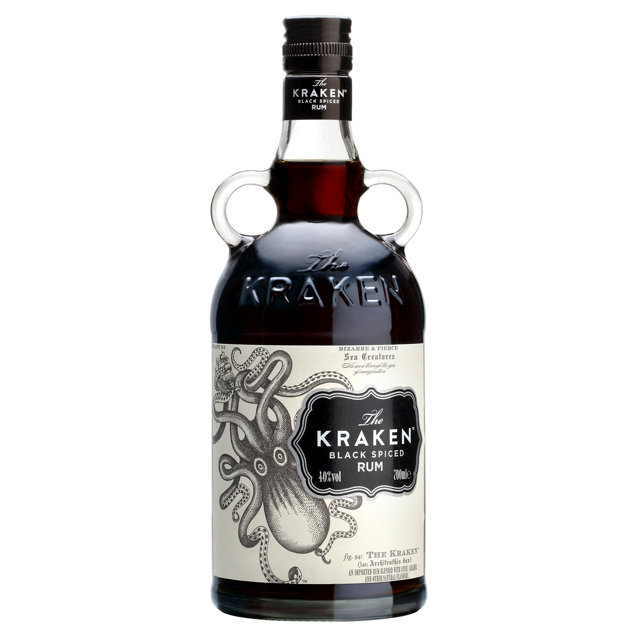
- Kraken Rum by Steven Noble
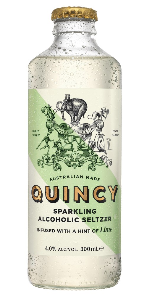
- Quincy by Steven Noble
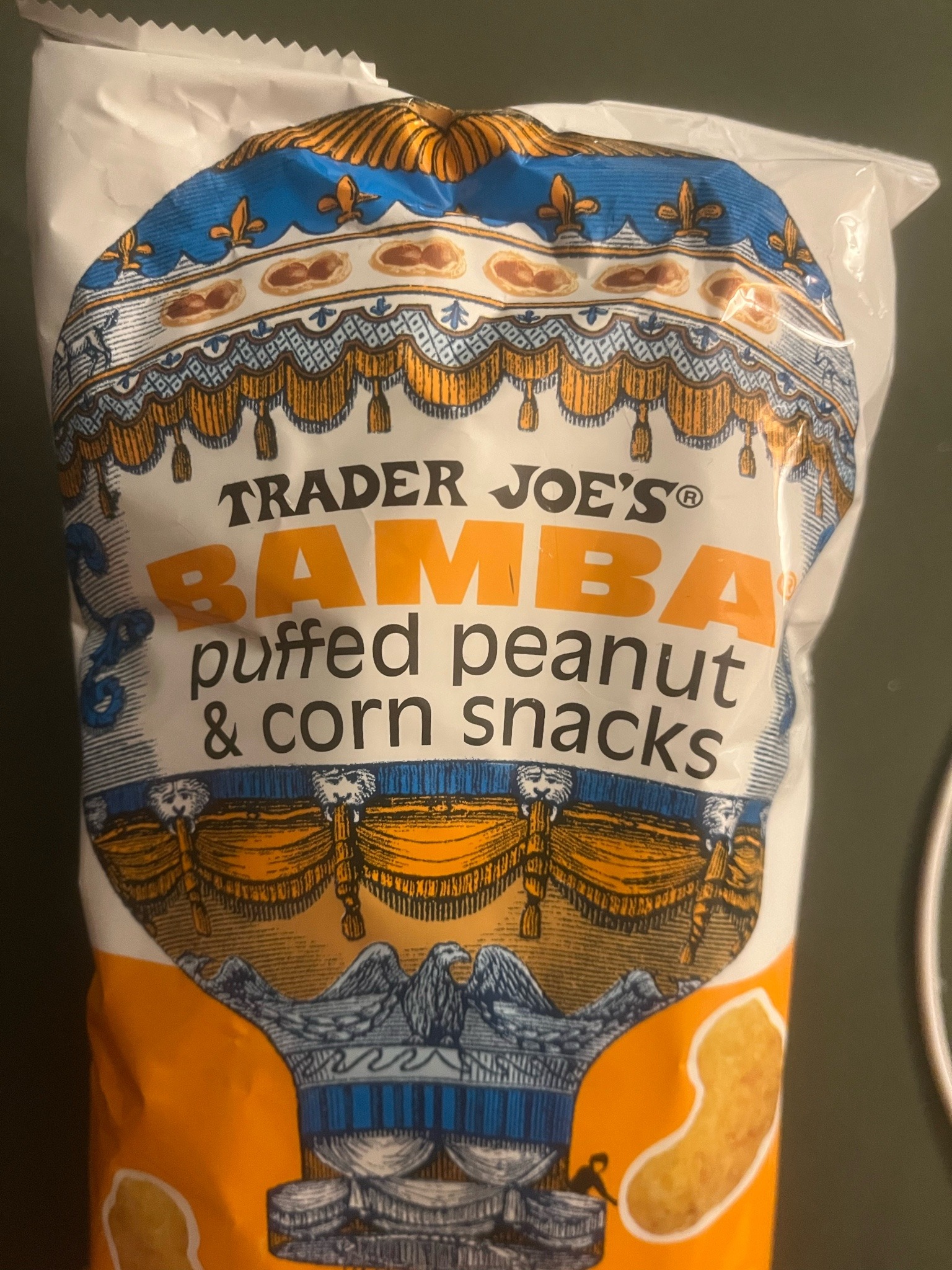
- Trader Joes
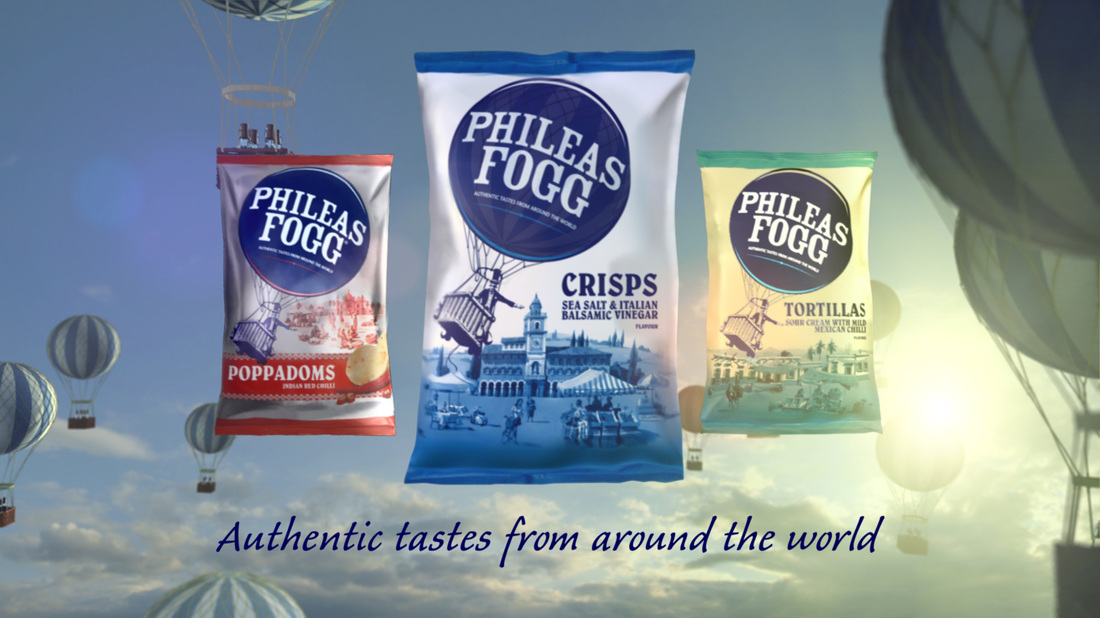
- Phileas Fogg crisps
- The brand was relaunched under this design in 2009 by United Biscuits; and the design was changed again in 2013 by KP Snacks
- Notice the advertising slogan that flavours are from 'all around the world'
- Check out this 2009 advertisement ('Phileas Fogg: Sea Salt & Indonesian Black Peppercorn Advert')
- Brand name references the lead character of Jules Verne's Around the World in 80 Days, and packaging has always had a Victorian theme.
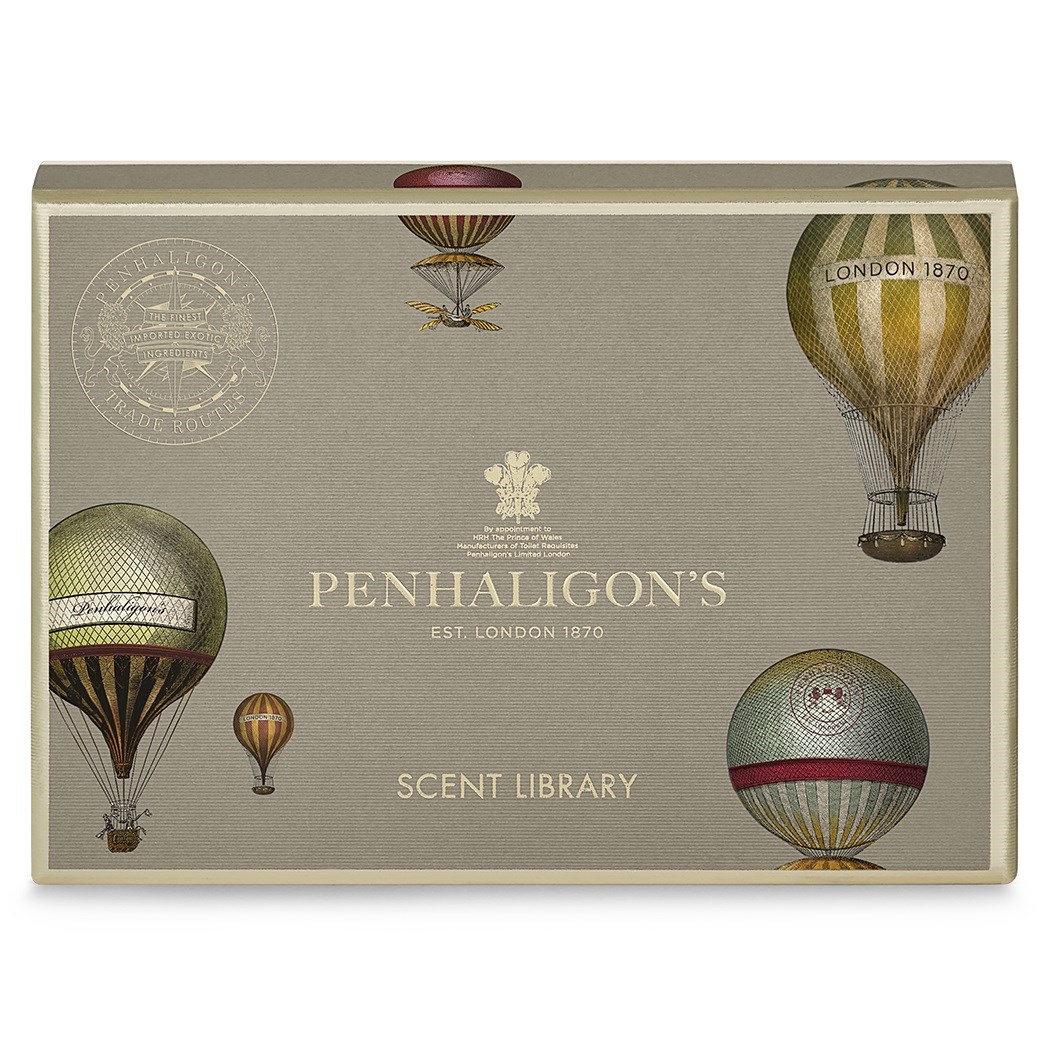
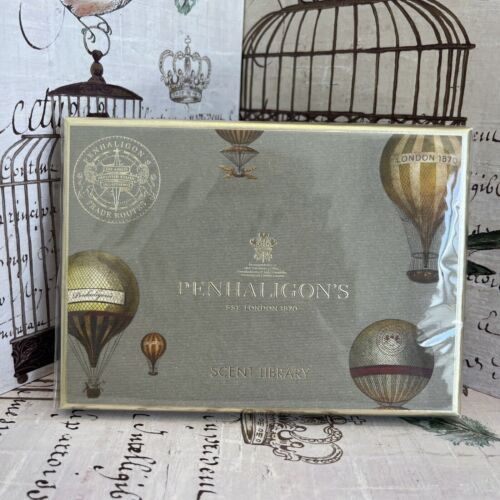
- The 'Trade Routes' collection began in 2014, inspired by the 19th century travellers and discovery to represent international scents - the same logic as Phileas Fogg crisps.
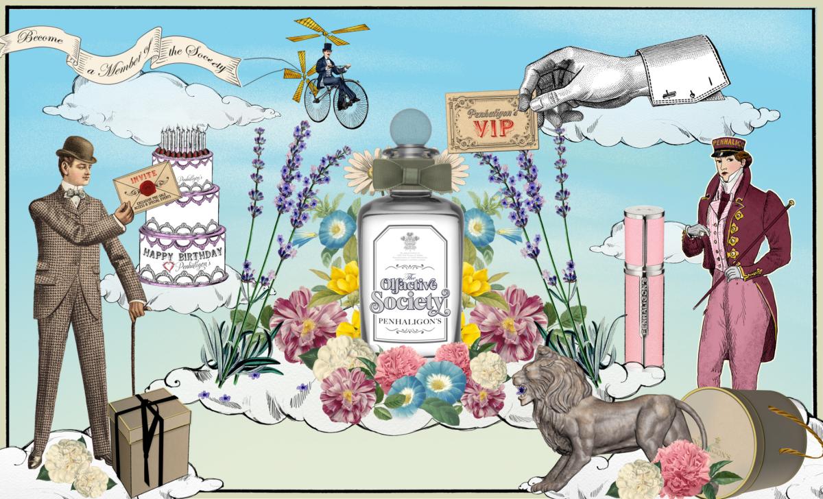
- Penhaglion's brand loyalty club is called 'The Olifactive Society'
- It prominently displays its Royal favour as part of its brand positioning.
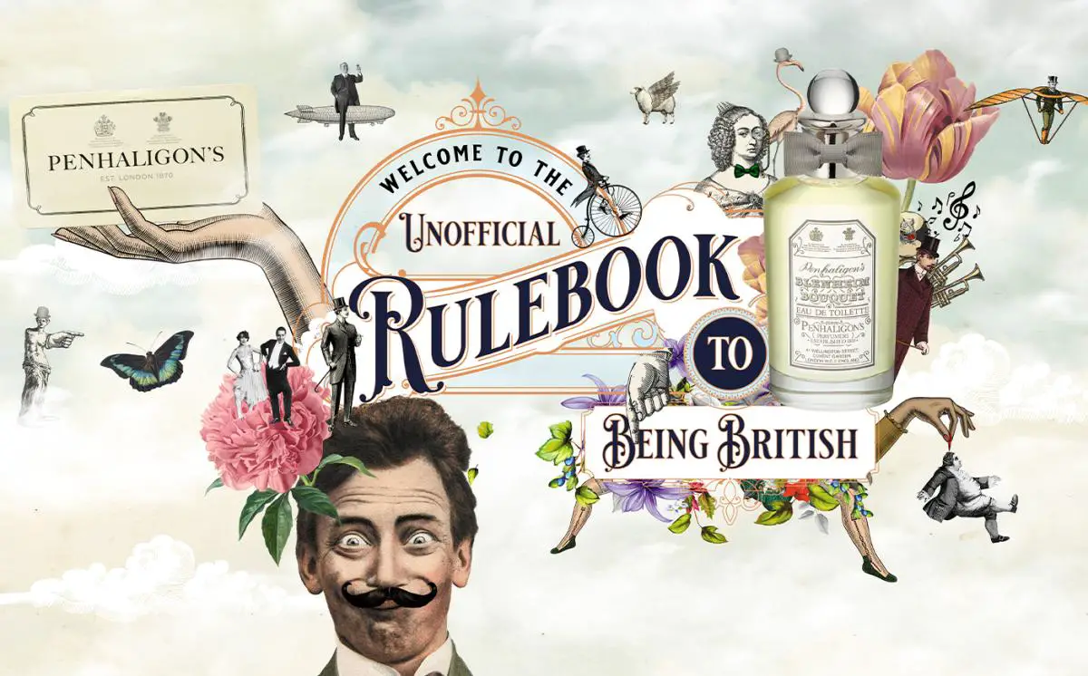
- Penhaglions continue to use SCW motifs as their look
- Here is their "heritage" page - note references to royalty, Saville Row, and the queasy colonialist tone it mimics (and reproduces) when talking about its Cairo scents
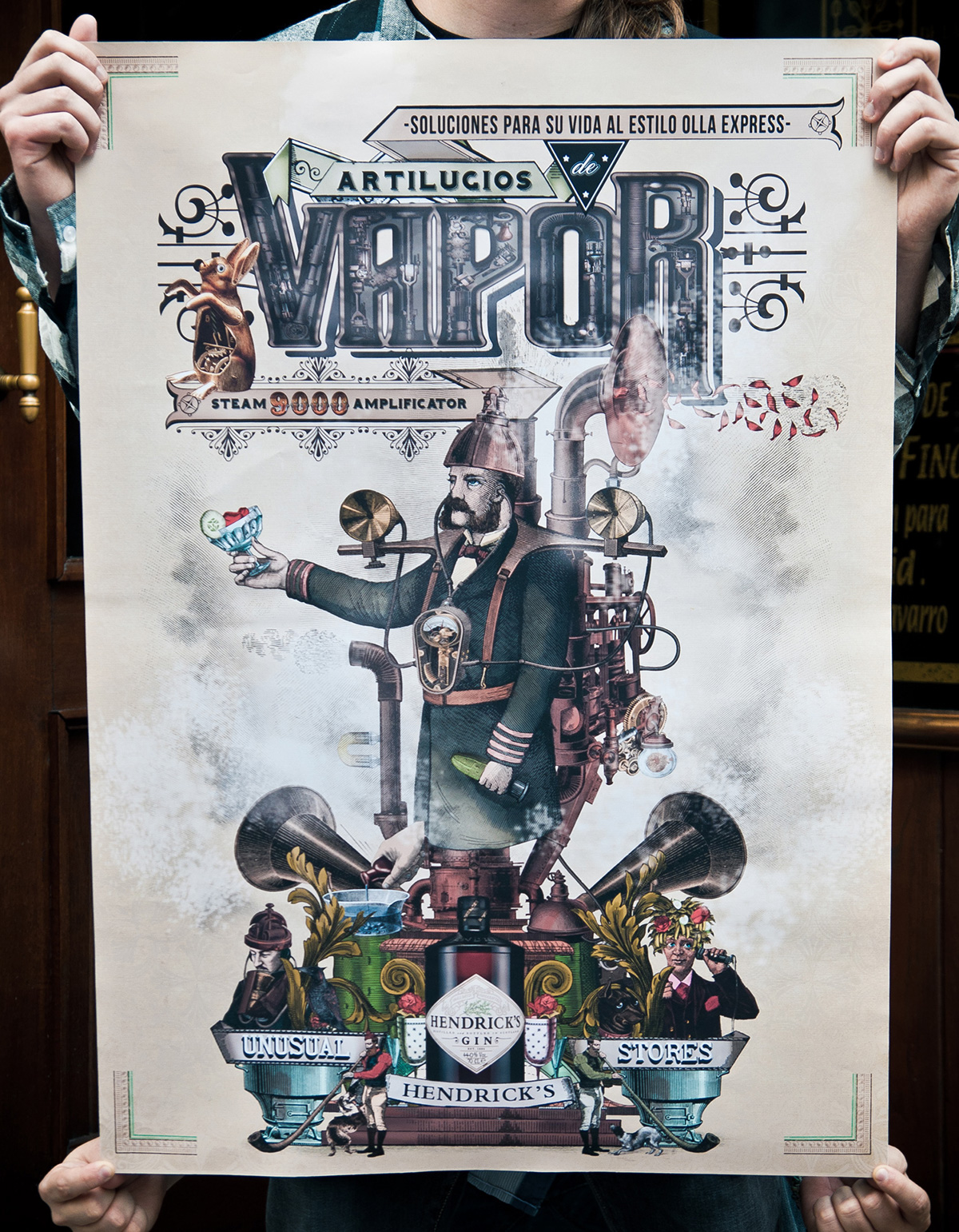
- A campaign for the Spanish market designed by Draftfcb, 2010 - 2012
- ""Unusual Rose and Cucumber Society" is the most this aesthetic phrase ever"
- Post-September-2017 advertising campaign
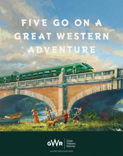
- GWR evokes nostalgia for its own posters (circa 1920-1940) and the part-of-the-british-psyche kids go on a jolly holiday books The Famous Five by Enid Blyton
- Fringe example: it's got a hot air balloon, trains, a motorbike with a sidecar, vintage boats; it does decoupage with a vintage visual design; it's 1940s so just within period; and while a trip to the seaside isn't exactly colonial, it is willfully blind to how racist (and therefore, how uncosy) Blyton's writing is
- As a 2017 example, it's very late for the peak SCW period; and crucially, it is post-Brexit-vote (in 2016) which was powered in part by imperial nostalgia & nationalist vibes. Anxiety around Englishness and Brexit was probably a key reason this trend (starting ~2001) survived for a second wind into the 2010s.

Other
- Game: Bioshock Infinite (2013)
- Considered 'steampunk'. Includes zeppelins and travelling on zipwires, a lighthouse, 'ironic' racism, lots of 1910s packaging and advertisements, and has an 'airy' feel.
- Interestingly, the original designs for Infinite were set in a 'dark carnival/decay victoriana' style aesthetic, which is adjacent to this trend.
- Concept work on the game began 2008
- Inspired by 1893 World's Columbian Exposition
- The Chrismans, who live as Victorians full time, and were widely mocked on social media for it (2015).
- Their website
- Mr Chrisman has that most 'hipster' of jobs, in bicycle making & repair
- but notice how this in many ways foreshadows the popularity of 'tradwife' influencing now. In this sorry era, a woman preferring to stay home, sew and live traditionally would not be so universally mocked.
- Among other things, you see the intermediate popularity of the historic fashion community 'laundering' these ideas into the general population: from 'insufferably twee hipsters' the Chrismans; via appealingly feminine influencers such as Bernadette Banner talking reviving the neglected women's history of hand-sewing and style; via more sinister content arguing the corset was good and that feminine women & qualities are marginalised in historic media (where???); towards actual fascist influencing that connects this 'woman-as-feminine-homemaker' fantasy to loathesome politics.
- Made by a member of Neutral Milk Hotel - Julian Kloster - while he was on the reunion tour with the band, this podcast seems to be dedicated to anachronistic, twee, and surreal.
- Radio (old technology) broadcasting from the top of the Eiffel tower
- designed by Railey Bace Prints, 2020
Fashion
The word 'dapper'. Hipsters. A fad for 'gentlemen' dressing - waistcoats, bad moustaches, bad suspenders, bowler and top hats, shirts without their pin-on collars - all done really badly (like, suspenders and a belt, or waistcoats with low-waist trousers). Frock coats
Part of why this fashion looks so bad is that:
- real suits are expensive but these were being bought at regular stores, and they're unfitted and unshaped and made from average fabrics
- victorian styles of coat and waistcoat are very different to modern ones the viewer knows it's uncanny valley victoriana without necessarily being able to say how and why
- suits are a formal language, they're not supposed to be 'mixed up' in this way. By definition, they look bad when you experiment with it.
'Ringmaster' tailcoats, bowler hats, historic military jackets,
The ubiquity of the 'moustache' in the ironic 'awesome moustache' trend.
'Wizard Chaps are sartorial and really rather stylish. They get their clothes and accessories from Old Town, Gentleman's Emporium, Savvy Row and other stores online. On the street their houndstooth comes from Dashing Tweeds, Dolly Dare or Beyond Retro, while their tartan comes from Vivienne Westwood and the brogues from Crockett & Jones. Authentic tweed was everywhere in the winter collections, from Prada to Margaret Howell to Rapha's dedicated tweed cycling suit. Shooting jackets were worn all over central London. Even All-Saints is full of Victoriana, with its riding habit style, faded leathers and funked-up muttonchop blouses.'Steampunk rockers: the trend for tweed - Jenny Hall - 2010
The two key looks for men were:
- eyeliner debauchery, Jack the Ripper, ringmaster of the dark circus, kinda rancid energy, like Jack Sparrow (for example, The Killers - Mr Brightside (2009))
- sepia waif farmboy destined to die in the trenches, currently runs a craft beer brewery and plays the accordion (ironically); i.e. Mumford and Sons
But a lot of men in these scenes would also just be wearing nice quality Marks and Spencers dressed-down-formal jumpers, shirts and trousers, like at an informal white collar workplace.
IMO, there wasn't an equivalent trend for women, but one possibility is visible Victorian underwear as outerwear: frilly petticoats; step-in slips and playsuits; corsets. Women associated with these movements were more likely to read as 1920s-1940s/rockabilly-adjacent/Dita von-Teese-adjacent, probably because actual victorian styles are not street-friendly the way modern whimsical men's vintage is.
I met someone who attended a Chap picnic, and they said a lot of women were wearing 30s/40s tea dresses. Another person remembered the decade:
when every girl wanted a knee-length or just above gored skirt that would flared when she spun, but darned if I remember what we called them.
Image Galleries
- Daily Mail: Chap Olympiad (2014)
- Guardian: Chap Olympiad (2010)
Masculinity & fashion
In this decade masculinity was, as it always is, in crisis. SCW provided models for an 'alternative masculinity' which both filled a desire for an 'outsider' position, but remained 'safe' as it provides no meaningful challenge to the status quo - a quirky of the mainstream
No fashion trend is capable of undoing patriarchy, but SCW was especially egregious as it drew from either twee farmhand or colonial adventurer aesthetics, both of which evoke the power of white men in the physicality of labourers and the actual geopolitical power of the colonialist and aristocrat.
This fashion/social style was popular with middle classes - filling the traditional role of the middle class to support upper-class lifestyles and values in the hope of joining them. As ever, people adopt ideas 'ironically' as a cover for adopting them sincerely. Products like moustache wax marketed with penny farthings and top-hats aimed to suggest the user would 'feel posh'; the subculture therefore was made of people for whom 'feeling like a Victorian aristocrat' seems an unproblematic life goal.
Cutesy appropriative vintage labourer looks, therefore, added insult to injury as their wearers were not in any sense salt-of-the-earth working men.
This was parallelled in queer fashion, epitomised by DapperQ - a fashion website for butches - founded 2013. Notably, 'dapper' has wealthier overtones than the working class masculinity traditionally associated with butches. There was a fad for bow ties, so you would look like a whimsical professor - rather than a car mechanic.
Some examples:
- The Chap magazine
- First published in 1999, this magazine broke public consciousness in the SCW era. See the dates on this coverage in mainstream newspapers, a good guide to when this trend had cultural relevance:
- There's a good Chap from The Independent (2003)
- The Vulgarian Invasions - interview with Gustav Temple from 3:AM Magazine (2004)
- BBC News coverage of the Chap Olympiad (2006)
- Article on The Chap and steampunk from the Evening Standard at the Wayback Machine (archived 10 October 2012)
- The 11th annual Chap Olympiad in pictures from The Daily Telegraph (2015)
- considers itself to have a 'comic and eccentric twist' on vintage style and values. Wikipedia: 'Tongue firmly in cheek, it espouses its own unique lifestyle philosophy called anarcho-dandyism'
- First published in 1999, this magazine broke public consciousness in the SCW era. See the dates on this coverage in mainstream newspapers, a good guide to when this trend had cultural relevance:
- Art of Manliness - founded 2008 - 'lifestyle' website
- Earliest capture - 2008
- In 2010
- In 2023
- Notice: victorian engraving on the logo, and as a design feature in diagrams/illustrations throughout the site; unironically using vintage masculinity as an aspiration; sepia; boardwalk vaudeville figure of the boxer
- The site is still going, but has more of a modern look and generic advice content compared to its heyday
- Cup of Brown Joy - Professor Elemental (2008)
- an example of 'chap hop' which went viral
- The other notable figure was Mr B. the Gentleman Rhymer, with whom Professor Elemental had a faux-rivalry
- notice: victorian visual elements, cutesy use of victorian motifs, somewhat tasteless political implications/'we're all post-race now so we can joke about colonialism', going 'round the world in 80 brews'
Music
There was a music trend associated with this visual movement, although at first glance it's unexpected.
Quoting from Steampunk rockers: the trend for tweed - Jenny Hall - 2010 in the London evening standard
The soundtrack that accompanies the new what-ho! lifestyle comes from bands such as Abney Park, Mumford & Sons, Johnny Flynn & the Sussex Wit, E.S. Posthumus and Tom Waits. Perhaps a banjo or a hurdy-gurdy shanty beat accompanying a husky voice, with a dash of honky-tonk piano.
You might point out that Mumford and Sons and Johnny Flynn are both indie or genericana, but to me it's relevant because this was what these people were listening to. The consumer of soft colonial wanderlust was not (primarily) attracted to music which 'sounded' victorian or historic, or 'world music' (the idea of wanderlust did not, say, produce a renewed Western fad for sitar music). Instead, they were drawn to an extremely white, down-to-earth, 'handmade' indie sound.
Bands included Arcade Fire, Decemberists, Fleet Foxes.
- Postmodern Jukebox (2011)
- Thrift Shop - their first viral hit
- vintage-style covers of modern songs
- acoustic bass
- questionable visuals of reclaiming a rap song in a 'traditional' manner, akin to chap hop
- See also: 2012 Postmodern Jukebox - doing a cover of Hash Pipe by Weezer (disconnect between original song context and classy white jazz vibes), credited to 'Thomas Jefferson and his Ragtime Orchestra', both ignorant of the racial politics but also trading off a bit of the edge of that too
- or 2012's Celebrating the Artistry of Shaggy, white hands playing smooth posh restaurant jazz
- Electroswing
- 'Gypsy jazz'
- Mumford and Sons - important because it's cosplay folk, with members being actual aristocrats or politically fascist
- Twee instruments: accordions, ukuleles, trumpets, fiddles, banjo, singing saw, acoustic bass
However, the 'gothy' end of the subculture did listen to more subcultural music - such as Bellowhead, Abney Park, and chap hop. One song of the era I had on my playlist by Worsted went
seduction and doffing are so interlocking
you can't really tell them apart
if you want to get a girl, get yourself a hat
and doff your way into her heart
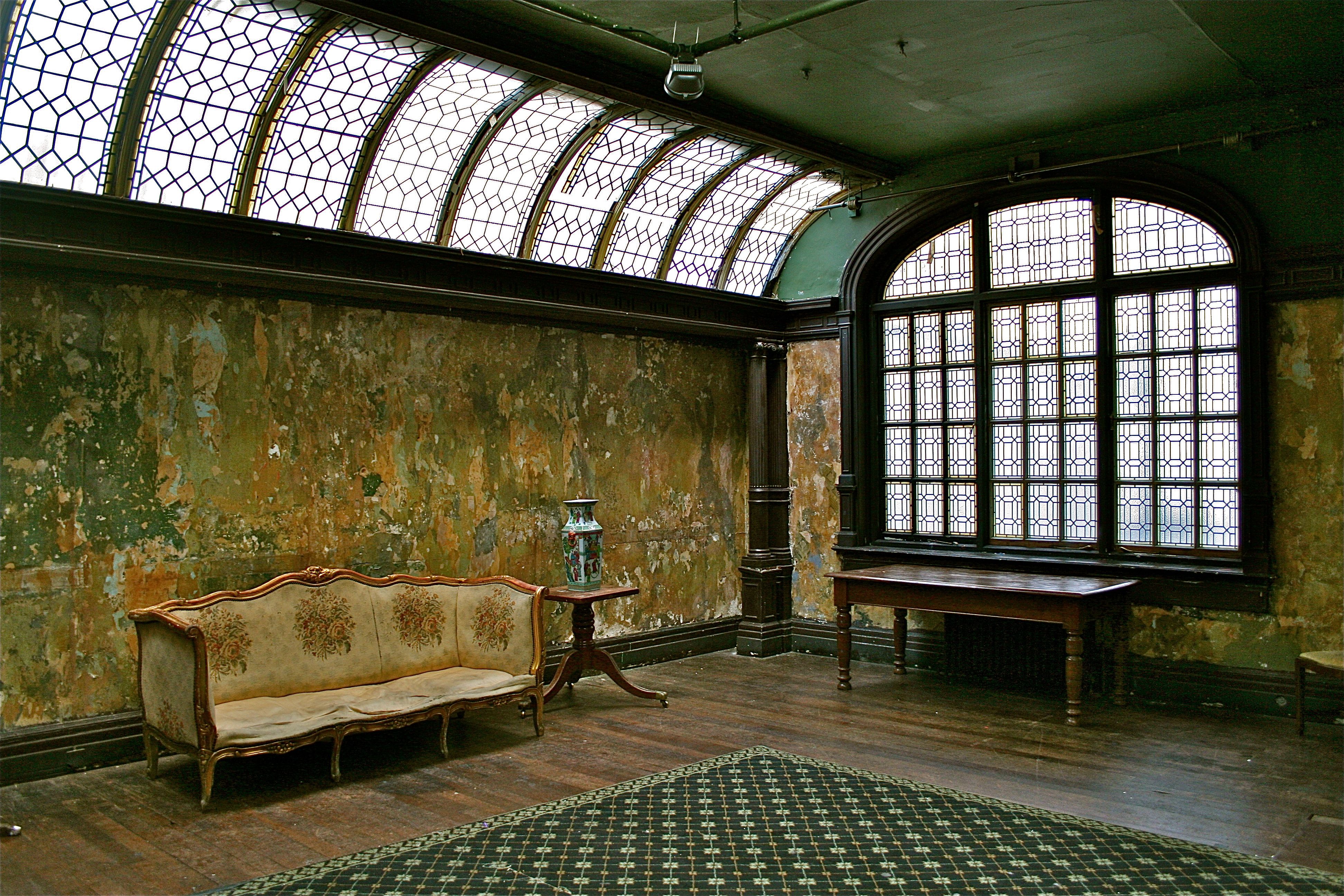
Interior Design
In this era, I was in no position to buy permanent objects for my home, so I feel less certain of describing this; which is frustrating, as consumer objects tend to be more ephemeral than films or albums.
I associate this era with wallpapers, cushions and curtains with huge damask motifs, like this:
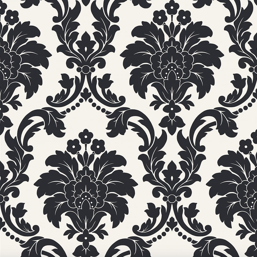
I have this motif on a pillowcase bought in 2009, which I still own. It is a rich, warm purple, with the pattern raised in flock, and it came from a supermarket (i.e. targeted at the 'affordable' customer).
Rather like the badly put together menswear, nobody was replicating a real Victorian room. Instead, the logic of collage would throw together 'posh feeling' furniture pieces with modern logic - for example, these rooms were rarely cluttered (in the way of actual victorian decor). There would be that wallpaper, one rococo sofa, and maybe a modern lampshade on bare wooden boards. The feeling of a theatre stage set of a room.
I remember plates and notebooks with SCW collaged Victorian images on, often ironic juxtapositions (a lion in a top hat, a rhino on a penny farthing) in black on the cream white ceramic. The following plates were photographed in 2023 at Machen Interiors, Caerleon, Wales - I couldn't get the designer's name. In the SCW period, these things were EVERYWHERE, including supermarkets and upmarket stores off Picadilly. I made a special 2hr trip to revisit this shop with a camera to capture what these 2023 plates looked like.
Big ornate frames as a design motif, but often in all black or a single tone, rather than being golden or distressed golden. And strings of lightbulbs as if at a carnival, throwing a chiascuro lighting contrast echoing the sense of a sepia B&W image or two-tone engraving.
The wallpapers, sofas and frames are neither victorian nor really colonial - they tend to be rococo - but they speak of a kind of ostentatious, posh, maximalist luxury, a celebration of feeling aristocratic (and a little debauched about it).
When i try and articulate what this looked like as a furniture style, I keep getting the mental image of 'porn that wants to be posh'. I think I am remembering the titillating news cycle that The Kings Speech (2011) was filmed at 33 Portland Place, a London address which was also the set for porn films, and possibly fancy orgy parties.
I am reminded, quite against my preference, of getting messages on dating sites from men who self-define as 'gentlemen' and wear badly fitted bowler hats and waistcoats, as if this pretense of sophistication is supposed to communicate something Elevated about their personality or values. These guys are still about, especially in BDSM scenes - but this is no longer a mainstream kind of guy who appears in music videos and popular culture. This kind of guy continues to be accompanied by girlfriends who dress goth, or pinup-vintage. In the SCW period, this kind of thing was considerably more mainstream.
Interesting edge cases
- The Dawn is Your Enemy
- - Adult Swim Signoff Bumper (2005-2010)
- designer unknown
- this was proposed as SCW because of the use of cutup; but I think this is Haunted Generation, drawing from the mood of an unsettling 1970s television childhood
- Music video: Since I Left You - the Avalanches (2009)
- flickering film, juxtaposition of past and present, and fashion elements
- But no collage, and mostly in the present day
- Music video: Feeder - Just The Way I'm Feeling (2002)
- Uses 1920s-style film footage as collage elements
- yet doesn't quite feel right
- Music video: Little Lion Man - Mumford and Sons (2009)
- interior and fashion design, ironic use of twee folk instruments
- but no collage, travel or specifically Victorian elements
- Album Cover: We All Have Hooks for Hands - the Pretender (2007)
Associated Aesthetics
Steampunk
Steampunk was popular at the same time as this trend, so there are aesthetic and political overlaps; but there are some distinctions
- Steampunk tends to have more of a warm, rich physicality (metal, rust, wood, leather) whereas SCW is related to analogue recording material and dryness (cut outs from old books, flickering silent film)
- Steampunk is oily, clanky, whereas this is insubstantial - its machenery is far more windlike, whimsical and make-believe. Steampunk machines are spectacular, but they look like they might work - they are spaceships. SCW machines are dreamlike
- SCW isn't a narrative genre, it's a visual aesthetic presented by brands to consumers. Steampunk, in origin, is a retrofuturist science fiction/alternative history genre, and hobby subculture.
- SCW rarely includes cogs, recognised as the cliche hallmark of Steampunk (see chaphop meme hit Reginald Pikedevant (2011) Just Glue Some Gears On It (And Call It Steampunk) - a video which animates vintage photographs in SCW style)
- SCW often feels haunted; steampunk is bombastic
- Another thing I'm thinking as I work is that a lot of the visual motifs here seem to be Victorian...but the way they are presented is typically 1920s...like, flickering film and Georges Melies quotes, or Dadaist collage compositions. We are in a ~time and place~ for sure, but no time and place that ever existed. & in many ways i feel like this "victoriana but make it 1920s" is the hallmark of SCW, maybe, maybe, which distinguishes it from steampunk.
It's probably not true to say that SCW 'isn't' steampunk. The term 'steampunk' was in popular use at the time and used to refer to all things which might be linked to it.
Once you start citing Panic! as a decay victoriana reference point, you essentially need their complete works. Here they are, mainstreaming Steampunk in their Ballad of Mona Lisa video (2011)
unsorted
Click here to view mess
- https://en.wikipedia.org/wiki/The_Music_Tapes
- Series of unfortunate events - artwork
- O'Reilly Anmals
- 2005 - The Mysterious Geographic Explorations of Jasper Morello - the most soft colonial wanderlust thing I've ever found
Original description
Photos of people spanning from the Victorian era to the 1940s (at most, not too into the Fifties) culture/aesthetics appropriated for modern day consumption. Maps, wanderlust and leisure travel via boat or small aeroplane. Chinoiserie/Japonisme and general Orientalism (think blue on white Ming Dynasty pottery used exclusively by white people). Carnivals and boardwalks, mail art, Neutral Milk Hotel's/Arcade Fire album covers, Baroque Pop, privileging of nature/ecology in art (throwbacks to Art Nouveau/Arts and Crafts Movement), sense of whimsy, hot air balloons, magical ways of looking at travel, phonographs, typewriters and general machinery of the decade that's on the verge of modernity being used today, but NOT exactly steampunk, floral wallpapers with crowning seen in cafe's that serve New American cuisine.
first published Jan 2025
 Return home